This example teaches you how to add a trendline to a chart in Excel.
1. Select the chart.
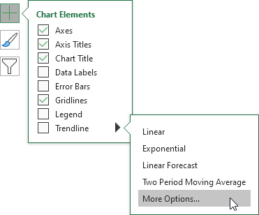
2. Click the + button on the right side of the chart, click the arrow next to Trendline and then click More Options.
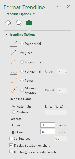
The Format Trendline pane appears.
3. Choose a Trend/Regression type. Click Linear.
4. Specify the number of periods to include in the forecast. Type 3 in the Forward box.
5. Check "Display Equation on chart" and "Display R-squared value on chart".
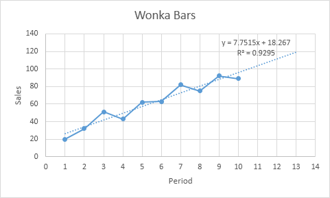
Result:

Explanation: Excel uses the method of least squares to find a line that best fits the points. The R-squared value equals 0.9295, which is a good fit. The closer to 1, the better the line fits the data. The trendline predicts 120 sold wonka bars in period 13. You can verify this by using the equation. y = 7.7515 * 13 + 18.267 = 119.0365.
