
This example teaches you how to create a Pareto Chart in Excel. The Pareto principle states that, for many events, roughly 80% of the effects come from 20% of the causes. In this example, we will see that roughly 80% of the complaints come from 20% of the complaint types.

To create a Pareto chart in Excel 2016 or later, execute the following steps.
1. Select the range A3:B13.
2. On the Insert tab, in the Charts group, click the Histogram symbol.

3. Click Pareto.

Result:

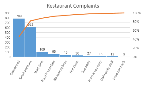
Note: a Pareto chart combines a column chart and a line graph.
4. Enter a chart title.
5. Click the + button on the right side of the chart and click the check box next to Data Labels.

Result:
Conclusion: the orange Pareto line shows that (789 + 621) / 1722 ≈ 80% of the complaints come from 2 out of 10 = 20% of the complaint types (Overpriced and Small portions). In other words: the Pareto principle applies.