Pie charts are used to display the contribution of each value (slice) to a total (pie). Pie charts always use one data series.
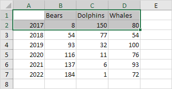
To create a pie chart of the 2017 data series, execute the following steps.
1. Select the range A1:D2.

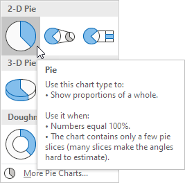
2. On the Insert tab, in the Charts group, click the Pie symbol.

3. Click Pie.

Result:

4. Click on the pie to select the whole pie. Click on a slice to drag it away from the center.
Result:

Note: only if you have numeric labels, empty cell A1 before you create the pie chart. By doing this, Excel does not recognize the numbers in column A as a data series and automatically creates the correct chart. After creating the chart, you can enter the text Year into cell A1 if you like.
