Learn Pivot Tables in Excel with this quick guide covering how to insert a pivot table, build and organize fields, sort data, filter data, change calculation methods, create a two-dimensional pivot table, and generate pivot charts to analyze data more effectively.
Table of Contents
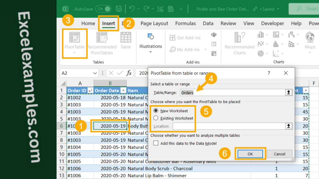
Inserting a Pivot Table
- Click any cell inside your dataset.
- Go to the Insert tab.
- Select PivotTable.
- Confirm the selected data range and choose where to place the pivot table (usually a new worksheet).
- Click OK.
A blank pivot table and the PivotTable Fields panel will appear.
Building the Pivot Table
To create a pivot table, simply drag fields into these areas:
- Rows – to group data by categories
- Columns – to compare data across categories
- Values – to calculate totals, counts, or averages
- Filters – to filter the entire report
Excel automatically summarizes numeric data, usually by summing or counting.
Sorting Data in Pivot Table
You can sort pivot table results to make them easier to read:
- Click any value in the Values column.
- Right-click and choose a sorting option (for example, largest to smallest).
This helps highlight the most important results.

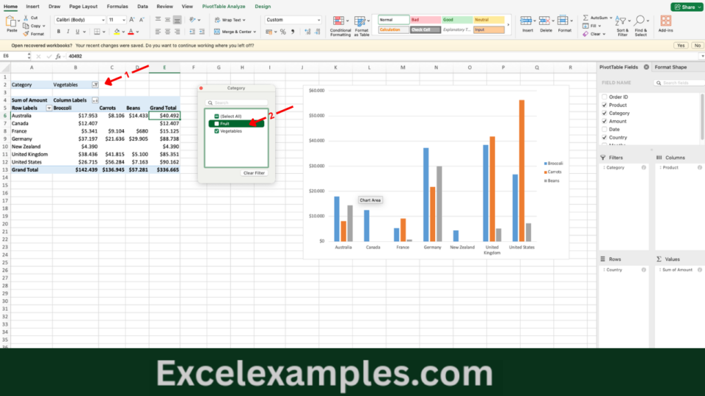
Filtering Data in Pivot Table
If a field is placed in the Filters area, you can use the dropdown menu to display only specific data.
You can also apply filters directly to row or column labels to narrow down the results further.
Changing the Calculation Method in Pivot Table
Excel summarizes numeric data by default, but you can change this:
- Right-click a value inside the pivot table.
- Choose Value Field Settings.
- Select a different calculation type (such as Count, Average, Max, or Min).
- Click OK.
This allows you to analyze the data in different ways without modifying the source table.

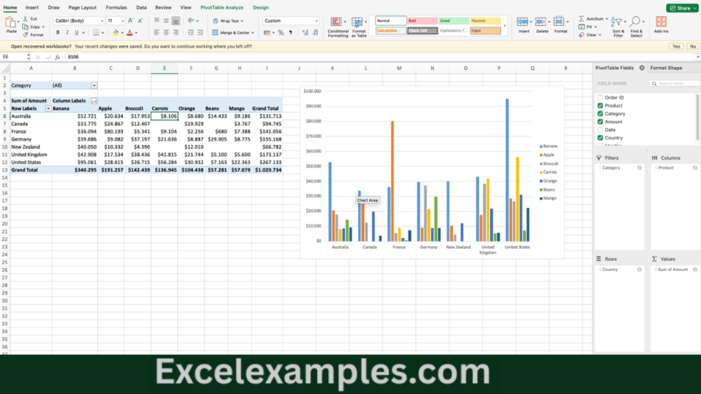
Creating a Two-Dimensional Pivot Table
By placing one field in the Rows area and another in the Columns area, you can create a cross-tabulated (two-dimensional) report. This makes it easier to compare data across two categories at the same time.

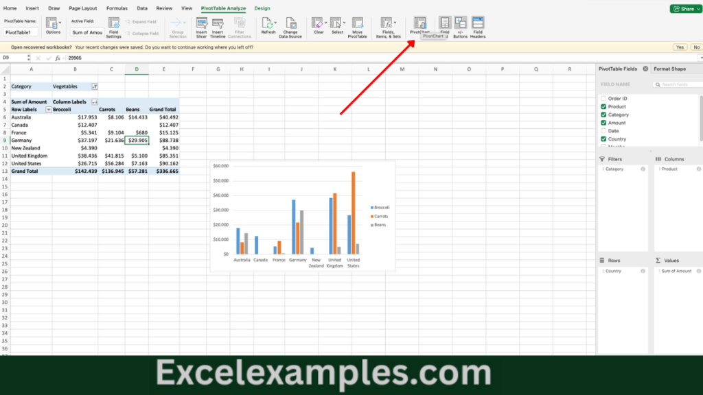
Creating a Pivot Charts
You can also create a Pivot Chart from a pivot table. This provides a visual way to compare and explore the summarized data, with filtering options built in.